Loading... ## 呼吸灯效果 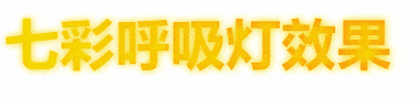 ```html <!DOCTYPE html> <span class="name">Name</span> <style> .name { font-size: 50px; background-clip: border-box; -webkit-background-clip: text; -webkit-text-fill-color: transparent; color: #FF512F; font-weight: 700; text-shadow: 0px 0px 7px #ffd800; background-image: linear-gradient(90deg, #ffd800 0%, #ff512f 100%, #fff); animation: glow-animation 2s infinite linear; color: #FFC0CB; box-sizing: border-box; vertical-align: inherit; } @keyframes glow-animation { 0% { filter: hue-rotate(-360deg) } 100% { filter: hue-rotate(360deg) } } </style> ``` ## 抖音效果 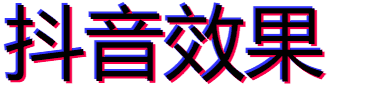 ```html <!DOCTYPE html> <span class="doudong">Name</span> <style> .doudong { animation: uk-text-shadow-glitch .65s cubic-bezier(1, -1.91, 0, 2.79) 0s infinite normal both running; } @keyframes uk-text-shadow-glitch { 0% { text-shadow: none } 25% { text-shadow: -2px -2px 0 #ff0048, 2px 2px 0 #3234ff } 50% { text-shadow: 2px -2px 0 #ff0048, -2px 2px 0 #3234ff } 75% { text-shadow: -2px 2px 0 #ff0048, 2px -2px 0 #3234ff } 100% { text-shadow: 2px 2px 0 #ff0048, -2px -2px 0 #3234ff } } @keyframes uk-flicker { 0% { opacity: 0 } 10% { opacity: .6; transform: scale(.8) } 20% { opacity: 0 } 40% { opacity: 1 } 50% { opacity: .2; transform: scale(1.1) } 100% { opacity: 1; transform: scale(1) } } </style> ``` 最后修改:2021 年 07 月 15 日 © 允许规范转载 打赏 赞赏作者 微信 赞 0 如果觉得我的文章对你有用,请随意赞赏

此处评论已关闭